library(here)       # manage file paths
library(tidyverse)  # your friend and mine
library(socviz)     # data and some useful functions
library(ggrepel)    # Text and labels
library(colorspace) # luminance-balanced palettes
library(scales)      # scale adjustments and enhancements
library(ggforce) # useful enhancements to ggplotPolishing and Presenting Plots
Modern Plain Text Social Science: Week 11
Duke University
November 12, 2024
Polishing your plots
and Presenting them
Load our packages
Piece by piece,
Layer by layer
Build your plots a piece at a time
# A tibble: 572 × 9
   Section        Sname Beginning Revenues Expenses Ending Journal  Year Members
   <fct>          <fct>     <int>    <int>    <int>  <int> <fct>   <int>   <int>
 1 Aging and the… Aging     12752    12104    12007  12849 No       2005     598
 2 Alcohol, Drug… Alco…     11933     1144      400  12677 No       2005     301
 3 Altruism and … Altr…      1139     1862     1875   1126 No       2005      NA
 4 Animals and S… Anim…       473      820     1116    177 No       2005     209
 5 Asia/Asian Am… Asia       9056     2116     1710   9462 No       2005     365
 6 Body and Embo… Body       3408     1618     1920   3106 No       2005      NA
 7 Children and … Chil…      3692     3653     3713   3632 No       2005     418
 8 Coll Behavior… CBSM       8127     3470     2704   8893 No       2005     708
 9 Communication… CITA…     17093     4800     4804  17089 No       2005     301
10 Community and… Comm…     26598    24883    23379  28102 Yes      2005     721
# ℹ 562 more rows
Build your plots a piece at a time
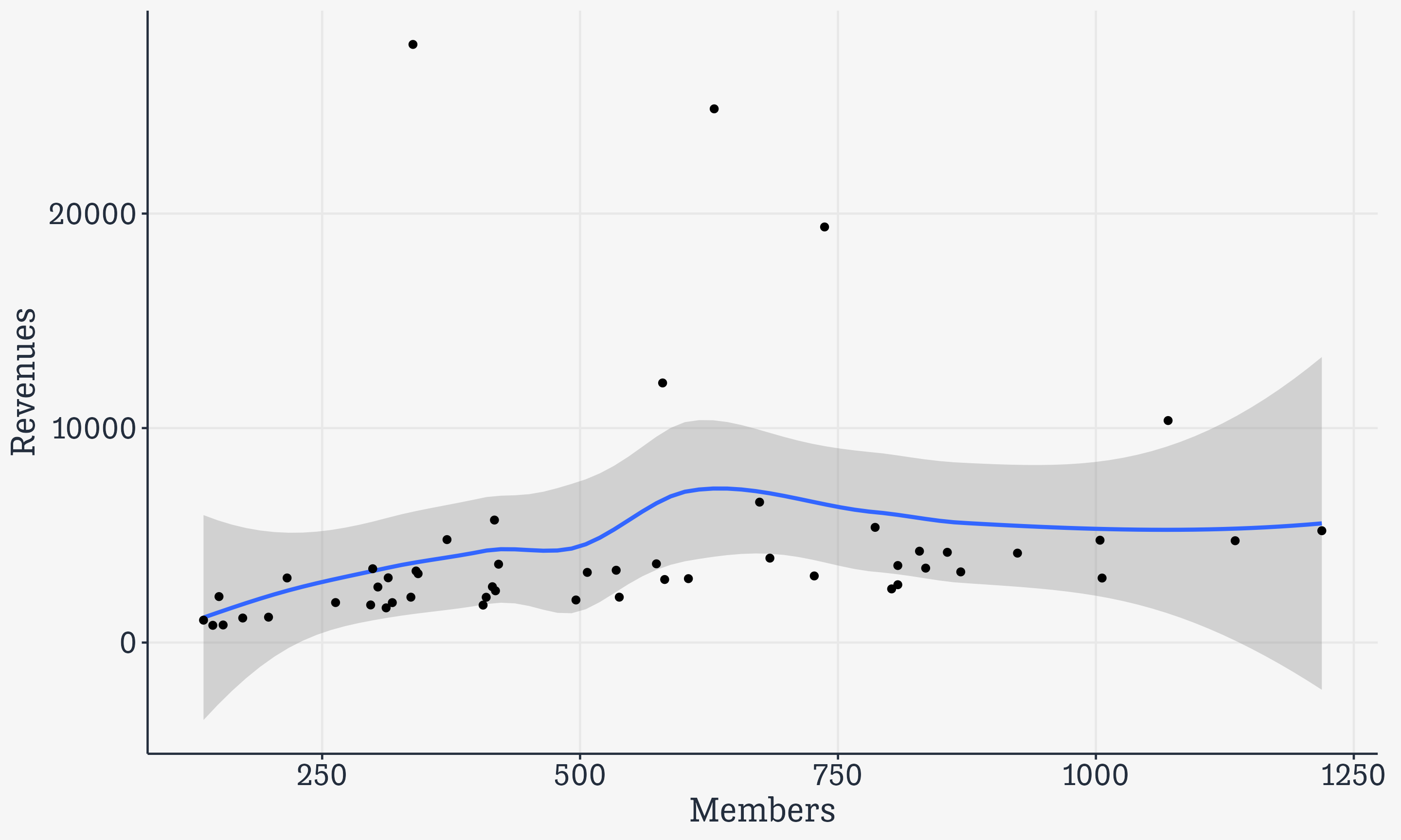
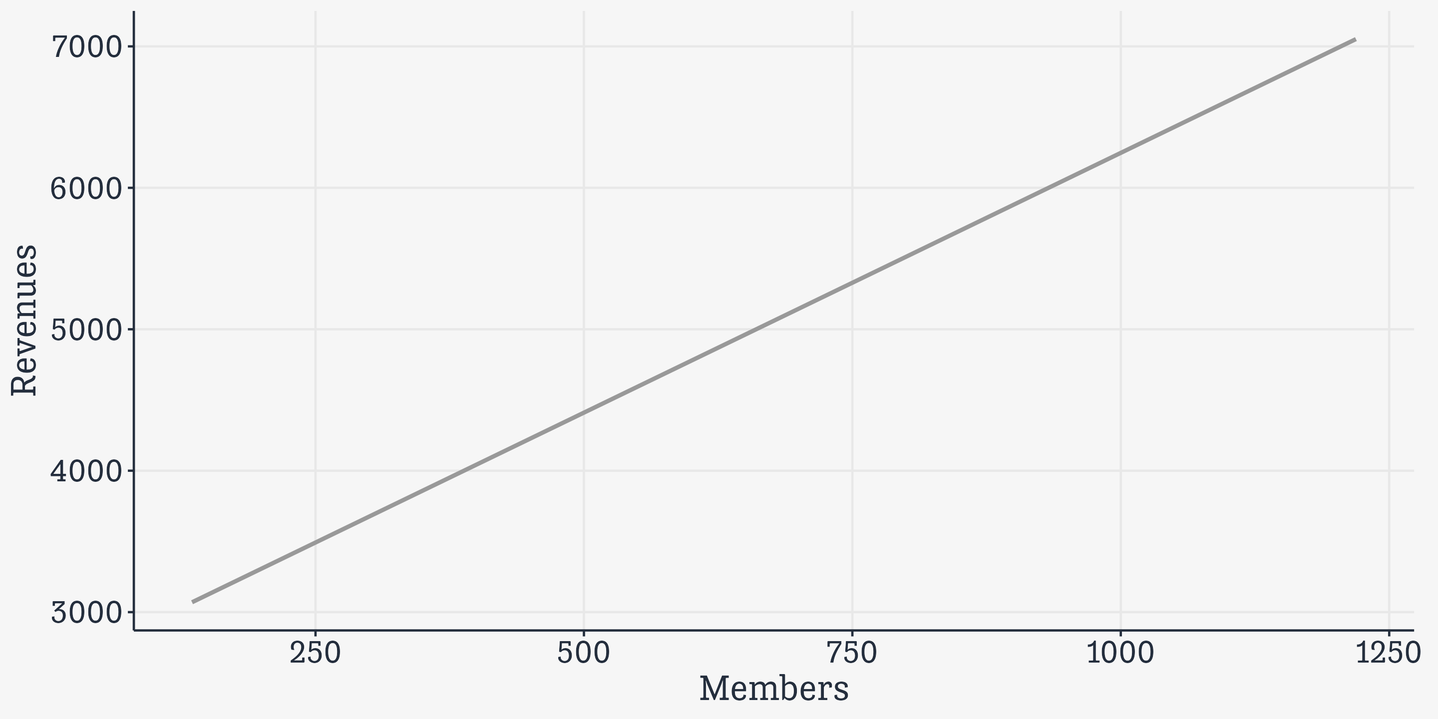
Build your plots a piece at a time
Build your plots a piece at a time
# A tibble: 572 × 9
   Section        Sname Beginning Revenues Expenses Ending Journal  Year Members
   <fct>          <fct>     <int>    <int>    <int>  <int> <fct>   <int>   <int>
 1 Aging and the… Aging     12752    12104    12007  12849 No       2005     598
 2 Alcohol, Drug… Alco…     11933     1144      400  12677 No       2005     301
 3 Altruism and … Altr…      1139     1862     1875   1126 No       2005      NA
 4 Animals and S… Anim…       473      820     1116    177 No       2005     209
 5 Asia/Asian Am… Asia       9056     2116     1710   9462 No       2005     365
 6 Body and Embo… Body       3408     1618     1920   3106 No       2005      NA
 7 Children and … Chil…      3692     3653     3713   3632 No       2005     418
 8 Coll Behavior… CBSM       8127     3470     2704   8893 No       2005     708
 9 Communication… CITA…     17093     4800     4804  17089 No       2005     301
10 Community and… Comm…     26598    24883    23379  28102 Yes      2005     721
# ℹ 562 more rows
Build your plots a piece at a time
# A tibble: 52 × 9
Section Sname Beginning Revenues Expenses Ending Journal Year Members
<fct> <fct> <int> <int> <int> <int> <fct> <int> <int>
1 Aging and the… Aging 12752 12104 12007 12849 No 2014 580
2 Alcohol, Drug… Alco… 11933 1144 400 12677 No 2014 173
3 Altruism and … Altr… 1139 1862 1875 1126 No 2014 318
4 Animals and S… Anim… 473 820 1116 177 No 2014 154
5 Asia/Asian Am… Asia 9056 2116 1710 9462 No 2014 336
6 Body and Embo… Body 3408 1618 1920 3106 No 2014 312
7 Children and … Chil… 3692 3653 3713 3632 No 2014 421
8 Coll Behavior… CBSM 8127 3470 2704 8893 No 2014 835
9 Communication… CITA… 17093 4800 4804 17089 No 2014 371
10 Community and… Comm… 26598 24883 23379 28102 Yes 2014 630
# ℹ 42 more rowsBuild your plots a piece at a time
Build your plots a piece at a time
Build your plots a piece at a time
Build your plots a piece at a time
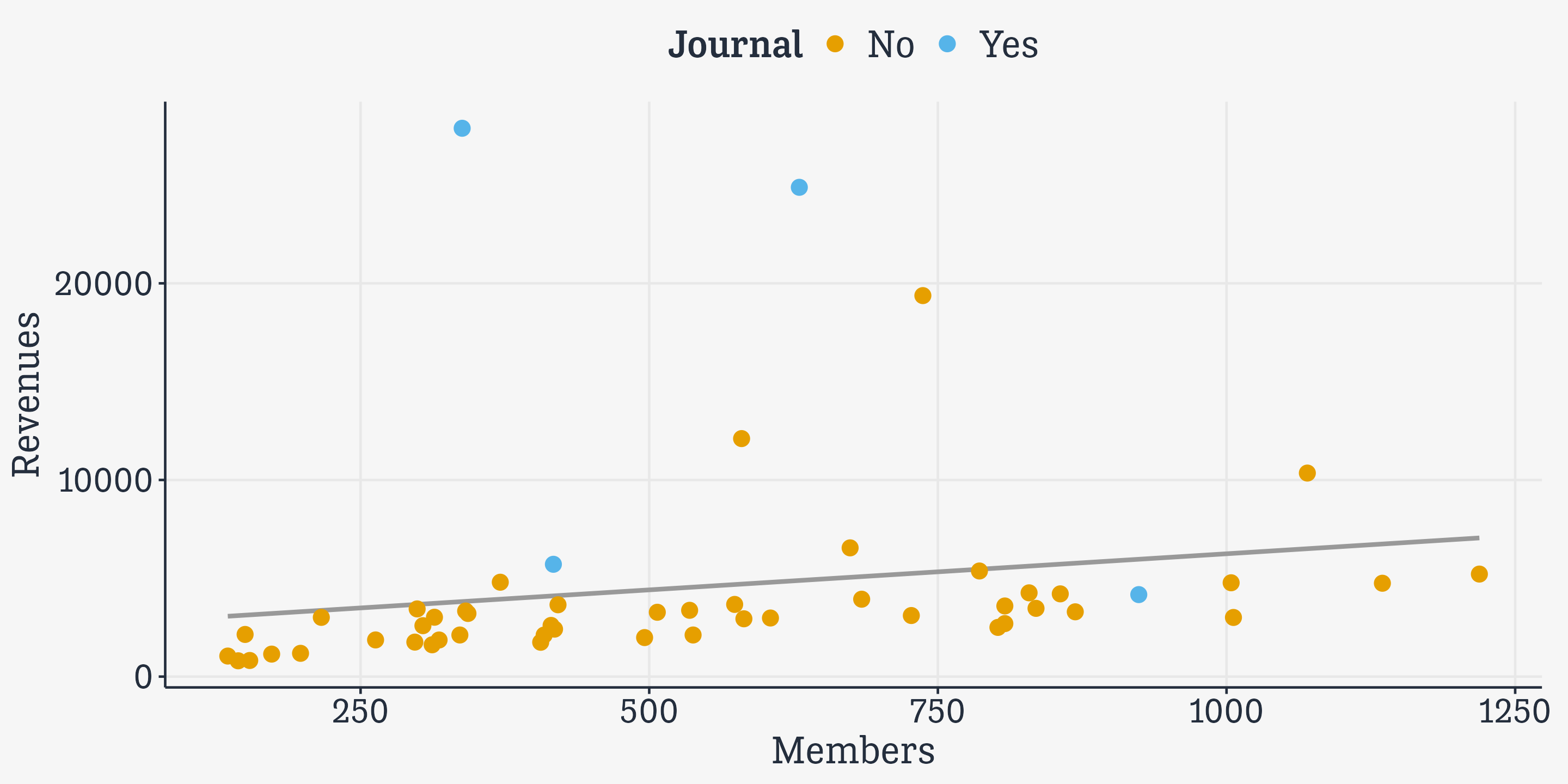
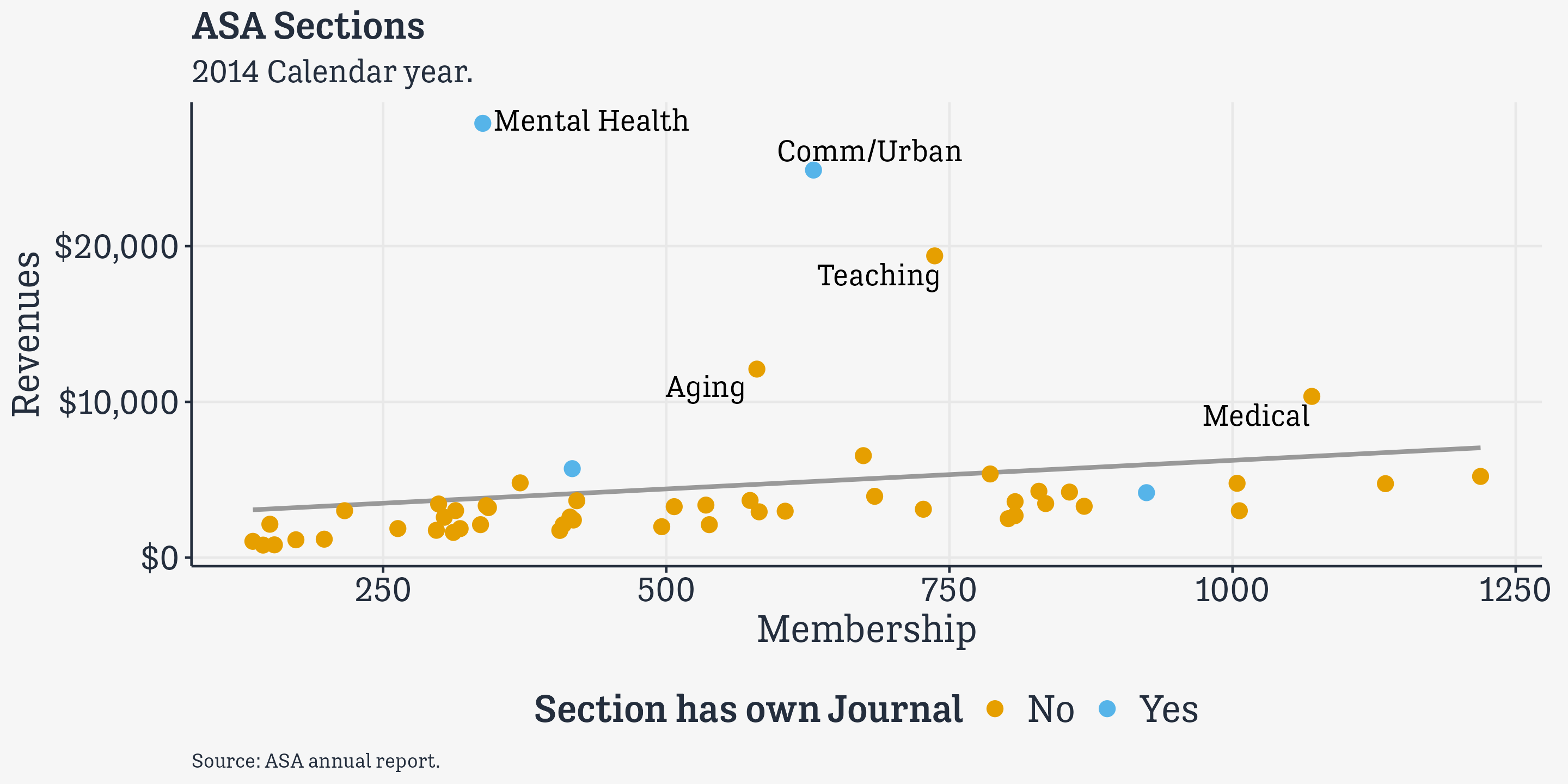
asasec |>
filter(Year == 2014) |>
ggplot(mapping = aes(x = Members,
y = Revenues,
label = Sname)) +
geom_smooth(method = "lm",
se = FALSE,
color = "gray60") +
geom_point(mapping = aes(color = Journal),
size = rel(3)) +
geom_text_repel(data=subset(asasec,
Year == 2014 &
Revenues > 7000),
size = rel(5),
mapping =
aes(family = "Tenso Slide"))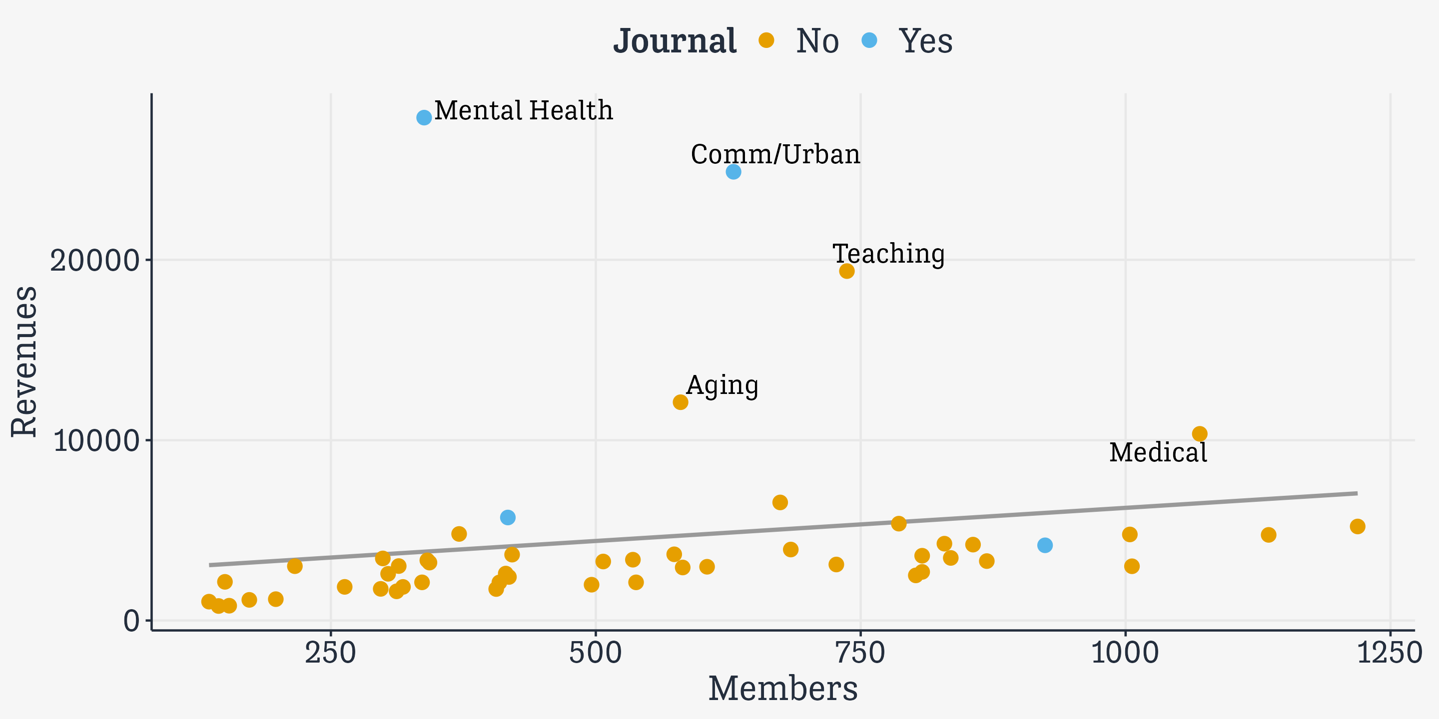
Build your plots a piece at a time
asasec |>
  filter(Year == 2014) |>
  ggplot(mapping = aes(x = Members,
                       y = Revenues,
label = Sname)) +
geom_smooth(method = "lm",
se = FALSE,
color = "gray60") +
geom_point(mapping = aes(color = Journal),
size = rel(3)) +
geom_text_repel(data=subset(asasec,
Year == 2014 &
Revenues > 7000),
size = rel(5),
mapping =
aes(family = "Tenso Slide")) +
scale_y_continuous(labels =
scales::label_dollar())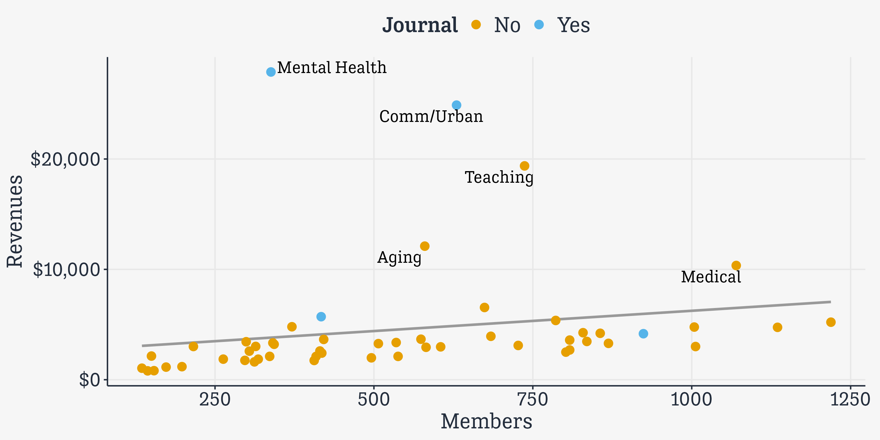
Build your plots a piece at a time
asasec |>
  filter(Year == 2014) |>
  ggplot(mapping = aes(x = Members,
                       y = Revenues,
                       label = Sname)) +
  geom_smooth(method = "lm",
              se = FALSE,
color = "gray60") +
geom_point(mapping = aes(color = Journal),
size = rel(3)) +
geom_text_repel(data=subset(asasec,
Year == 2014 &
Revenues > 7000),
size = rel(5),
mapping =
aes(family = "Tenso Slide")) +
scale_y_continuous(labels =
scales::label_dollar()) +
labs(x="Membership", y="Revenues",
color = "Section has own Journal",
title = "ASA Sections",
subtitle = "2014 Calendar year.",
caption = "Source: ASA annual report.")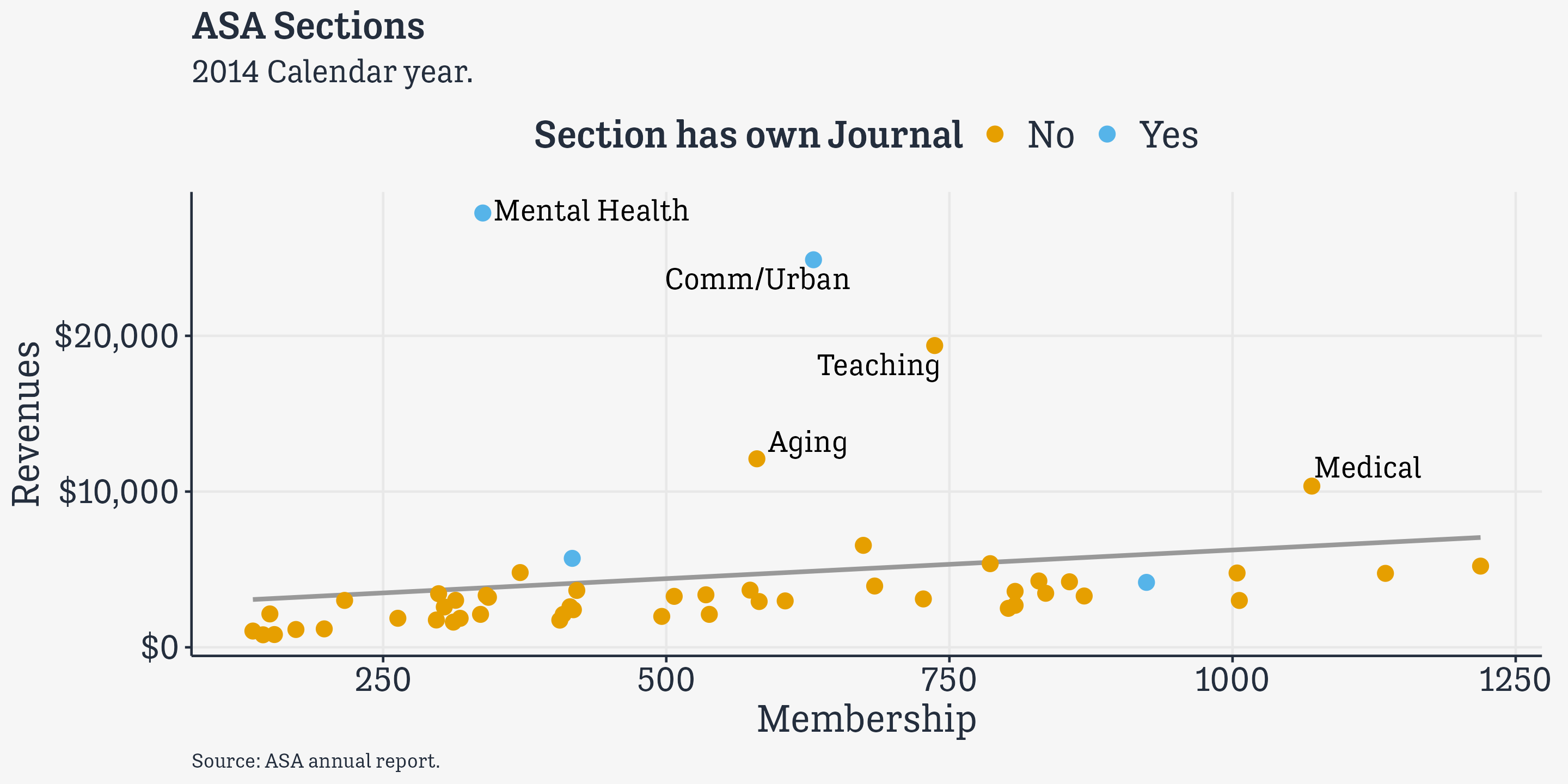
Build your plots a piece at a time
asasec |>
  filter(Year == 2014) |>
  ggplot(mapping = aes(x = Members,
                       y = Revenues,
                       label = Sname)) +
  geom_smooth(method = "lm",
              se = FALSE,
              color = "gray60") +
  geom_point(mapping = aes(color = Journal),
size = rel(3)) +
geom_text_repel(data=subset(asasec,
Year == 2014 &
Revenues > 7000),
size = rel(5),
mapping =
aes(family = "Tenso Slide")) +
scale_y_continuous(labels =
scales::label_dollar()) +
labs(x="Membership", y="Revenues",
color = "Section has own Journal",
title = "ASA Sections",
subtitle = "2014 Calendar year.",
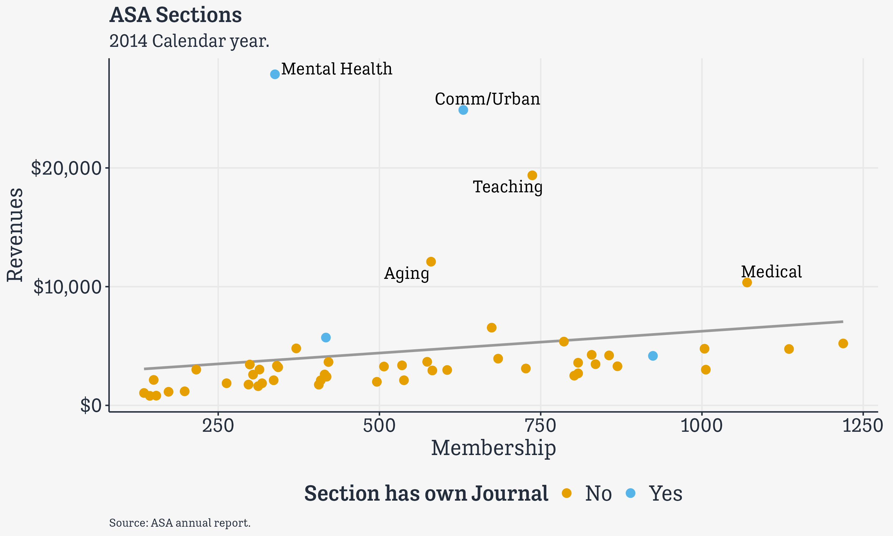
caption = "Source: ASA annual report.") +
theme(legend.position = "bottom")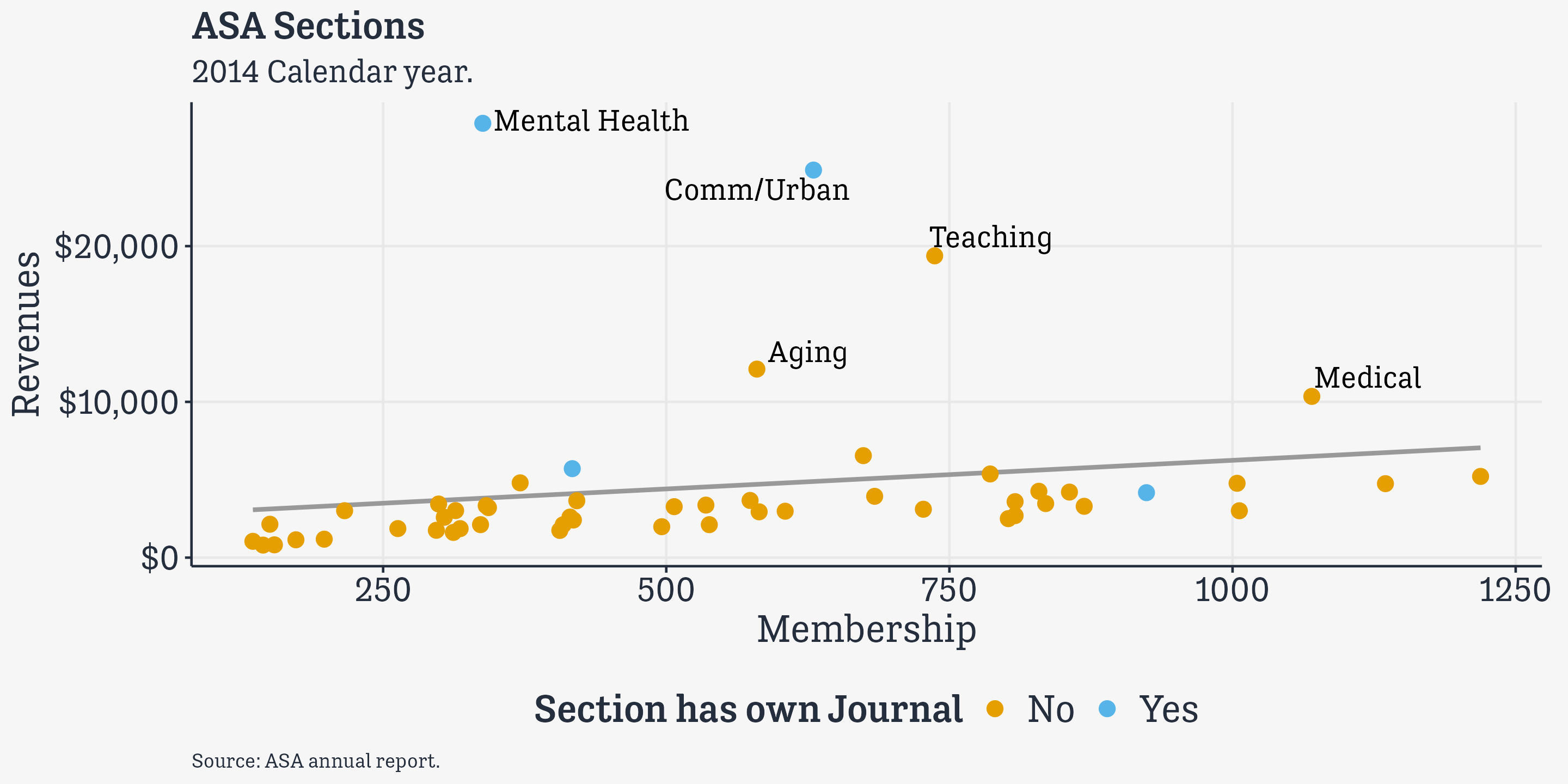
More about Scales
Working with color and fill scales
scale_<MAPPING>_<KIND>()
Scale functions control the display of the variables they map. So to change the colors for
colororfillmappings, you adjust the correspondingscale_function, not thetheme()function.ggplothas several color palettes built in. A variety of packages provide others.
You can specify scales manually
# A tibble: 238 × 21
   country   year       donors   pop pop_dens   gdp gdp_lag health health_lag
   <chr>     <date>      <dbl> <int>    <dbl> <int>   <int>  <dbl>      <dbl>
 1 Australia NA          NA    17065    0.220 16774   16591   1300       1224
 2 Australia 1991-01-01  12.1  17284    0.223 17171   16774   1379       1300
 3 Australia 1992-01-01  12.4  17495    0.226 17914   17171   1455       1379
 4 Australia 1993-01-01  12.5  17667    0.228 18883   17914   1540       1455
 5 Australia 1994-01-01  10.2  17855    0.231 19849   18883   1626       1540
 6 Australia 1995-01-01  10.2  18072    0.233 21079   19849   1737       1626
 7 Australia 1996-01-01  10.6  18311    0.237 21923   21079   1846       1737
 8 Australia 1997-01-01  10.3  18518    0.239 22961   21923   1948       1846
 9 Australia 1998-01-01  10.5  18711    0.242 24148   22961   2077       1948
10 Australia 1999-01-01   8.67 18926    0.244 25445   24148   2231       2077
# ℹ 228 more rows
# ℹ 12 more variables: pubhealth <dbl>, roads <dbl>, cerebvas <int>,
#   assault <int>, external <int>, txp_pop <dbl>, world <chr>, opt <chr>,
#   consent_law <chr>, consent_practice <chr>, consistent <chr>, ccode <chr>
You can specify scales manually
You can specify scales manually
You can specify scales manually
You can specify scales manually
You can specify scales manually
You can specify scales manually
You can specify scales manually
You can specify scales manually
You can specify scales manually
You can specify scales manually
You can specify scales manually
You can specify scales manually
You can specify scales manually
You can specify scales manually
You can specify scales manually
Use balanced palettes
- E.g., the
RColorBrewerPalettes - These are available through the
scale_color-brewer()andscale_fill_brewer()functions, as well as independently. - See the palettes with
RColorBrewer::display.brewer.all()
Qualitative palettes

Use balanced palettes
E.g., the RColorBrewer Palettes
These are available through the scale_color-brewer() and scale_fill_brewer() functions, as well as independently.
See the palettes with RColorBrewer::display.brewer.all()
Sequential palettes

Use balanced palettes
E.g., the RColorBrewer Palettes
These are available through the scale_color-brewer() and scale_fill_brewer() functions, as well as independently.
See the palettes with RColorBrewer::display.brewer.all()
Diverging palettes

Qualitative Brewer Palettes
p + geom_point(size = 2) +
  scale_color_brewer(palette = "Set2") +
  labs(title = "Set2")

p + geom_point(size = 2) +
  scale_color_brewer(palette = "Pastel2") +
  labs(title = "Pastel2")

p + geom_point(size = 2) +
  scale_color_brewer(palette = "Dark2") +
  labs(title = "Dark2")

p + geom_point(size = 2) +
  scale_color_brewer(palette = "Accent") +
  labs(title = "Accent")
Some color palettes


The colorspace package has more

Many palettes

So many colors
The colorspace function convention
scale_<MAPPING>_<KIND><COLORSCALE>()
scale_color_binned_diverging()
scale_color_binned_qualitative()
scale_color_binned_sequential()
scale_color_continuous_diverging()
scale_color_continuous_qualitative()
scale_color_continuous_sequential()
scale_color_discrete_diverging()
scale_color_discrete_qualitative()
scale_color_discrete_sequential()
scale_fill_binned_diverging()
scale_fill_binned_divergingx()
scale_fill_binned_qualitative()
scale_fill_binned_sequential()
scale_fill_continuous_diverging()
scale_fill_continuous_qualitative()
scale_fill_continuous_sequential()
scale_fill_discrete_diverging()
scale_fill_discrete_qualitative()
scale_fill_discrete_sequential()
Layer color and text
to your advantage

We know how to build this
We know how to build this
We know how to build this
We know how to build this
We know how to build this
## Brighter Blue and Red
party_colors <- c("royalblue1", "red2")
ggplot(data = subset(county_data,
flipped == "No"),
mapping = aes(x = pop,
y = black/100)) +
geom_point(alpha = 0.15, color = "gray30",
size = rel(2)) +
scale_x_log10(labels = label_comma()) +
geom_point(data = subset(county_data,
flipped == "Yes"),
mapping = aes(x = pop, y = black/100,
color = partywinner16),
size = rel(2))
We know how to build this
## Brighter Blue and Red
party_colors <- c("royalblue1", "red2")

ggplot(data = subset(county_data,
                     flipped == "No"),
       mapping = aes(x = pop,
y = black/100)) +
geom_point(alpha = 0.15, color = "gray30",
size = rel(2)) +
scale_x_log10(labels = label_comma()) +
geom_point(data = subset(county_data,
flipped == "Yes"),
mapping = aes(x = pop, y = black/100,
color = partywinner16),
size = rel(2)) +
geom_text_repel(data = subset(county_data,
flipped == "Yes" & black > 25),
mapping = aes(x = pop,
y = black/100, label = state,
family = "Tenso Slide",
face = "bold"), size = rel(3.5))
We know how to build this
## Brighter Blue and Red
party_colors <- c("royalblue1", "red2")

ggplot(data = subset(county_data,
                     flipped == "No"),
       mapping = aes(x = pop,
                     y = black/100)) +
  geom_point(alpha = 0.15, color = "gray30",
size = rel(2)) +
scale_x_log10(labels = label_comma()) +
geom_point(data = subset(county_data,
flipped == "Yes"),
mapping = aes(x = pop, y = black/100,
color = partywinner16),
size = rel(2)) +
geom_text_repel(data = subset(county_data,
flipped == "Yes" & black > 25),
mapping = aes(x = pop,
y = black/100, label = state,
family = "Tenso Slide",
face = "bold"), size = rel(3.5)) +
scale_color_manual(values = party_colors)
We know how to build this
## Brighter Blue and Red
party_colors <- c("royalblue1", "red2")

ggplot(data = subset(county_data,
                     flipped == "No"),
       mapping = aes(x = pop,
                     y = black/100)) +
  geom_point(alpha = 0.15, color = "gray30",
             size = rel(2)) +
scale_x_log10(labels = label_comma()) +
geom_point(data = subset(county_data,
flipped == "Yes"),
mapping = aes(x = pop, y = black/100,
color = partywinner16),
size = rel(2)) +
geom_text_repel(data = subset(county_data,
flipped == "Yes" & black > 25),
mapping = aes(x = pop,
y = black/100, label = state,
family = "Tenso Slide",
face = "bold"), size = rel(3.5)) +
scale_color_manual(values = party_colors) +
scale_y_continuous(labels = label_percent())
We know how to build this
## Brighter Blue and Red
party_colors <- c("royalblue1", "red2")

ggplot(data = subset(county_data,
                     flipped == "No"),
       mapping = aes(x = pop,
                     y = black/100)) +
  geom_point(alpha = 0.15, color = "gray30",
             size = rel(2)) +
  scale_x_log10(labels = label_comma()) +
  geom_point(data = subset(county_data,
                      flipped == "Yes"),
             mapping = aes(x = pop, y = black/100,
                           color = partywinner16),
size = rel(2)) +
geom_text_repel(data = subset(county_data,
flipped == "Yes" & black > 25),
mapping = aes(x = pop,
y = black/100, label = state,
family = "Tenso Slide",
face = "bold"), size = rel(3.5)) +
scale_color_manual(values = party_colors) +
scale_y_continuous(labels = label_percent()) +
labs(color = "County flipped to ... ",
x = "County Population (log scale)",
y = "Percent Black Population",
title = "Flipped counties, 2016",
caption = "Counties in gray did not flip.")
Leverage ggplot’s
layered approach


Layer,
Highlight,
Repeat
Build from ideas to data

The relationship of interest
Build from ideas to data

Theory says …
Build from ideas to data

Data suggests …
Repeat to differentiate

Pointrange
Repeat to differentiate

Add a comparison group
Layer and repeat with facets

Compare across facets
Layer and repeat across facets

Layer to compare
Layer and repeat across facets

Layer to copmare
X-Ray Vision

Seeing through it
Themes
Themes …
- are controlled by the
theme()function - can be bundled into functions of their own, like
theme_bw()ortheme_minimal() - can be set for the duration of a file or project with
theme_set() - make changes that are applied additively
- and most importantly …
Thematic elements do not represent data directly
Make a plot
Add a theme … theme_bw()
Add a theme … theme_minimal()
Add a theme … theme_dark()
Adjust with the theme() function
- None of this directly touches the parts of the plot that are representing your data—i.e. the visual parts that are mapped to a variable, and thus have a scale. Adjusting those is the job of the
scale_andguide()functions.
There are many theme elements
line rect text title aspect.ratio
axis.title axis.title.x axis.title.x.top axis.title.x.bottom axis.title.y axis.title.y.left axis.title.y.right axis.text axis.text.x axis.text.x.top axis.text.x.bottom axis.text.y axis.text.y.left axis.text.y.right axis.ticks axis.ticks.x axis.ticks.x.top axis.ticks.x.bottom axis.ticks.y axis.ticks.y.left axis.ticks.y.right axis.ticks.length axis.ticks.length.x axis.ticks.length.x.top axis.ticks.length.x.bottom axis.ticks.length.y axis.ticks.length.y.left axis.ticks.length.y.right axis.line axis.line.x axis.line.x.top axis.line.x.bottom axis.line.y axis.line.y.left axis.line.y.right
strip.background strip.background.x strip.background.y strip.placement strip.text strip.text.x strip.text.y strip.switch.pad.grid strip.switch.pad.wrap
legend.background legend.margin legend.spacing legend.spacing.x legend.spacing.y legend.key legend.key.size legend.key.height legend.key.width legend.text legend.text.align legend.title legend.title.align legend.position legend.direction legend.justification legend.box legend.box.just legend.box.margin legend.box.background legend.box.spacing
panel.background panel.border panel.spacing panel.spacing.x panel.spacing.y panel.grid panel.grid.major panel.grid.minor panel.grid.major.x panel.grid.major.y panel.grid.minor.x panel.grid.minor.y panel.ontop plot.background
plot.title plot.title.position plot.subtitle plot.caption plot.caption.position plot.tag plot.tag.position plot.margin
But they are structured
line rect text title aspect.ratio
axis.title axis.title.x axis.title.x.top axis.title.x.bottom axis.title.y axis.title.y.left axis.title.y.right axis.text axis.text.x axis.text.x.top axis.text.x.bottom axis.text.y axis.text.y.left axis.text.y.right axis.ticks axis.ticks.x axis.ticks.x.top axis.ticks.x.bottom axis.ticks.y axis.ticks.y.left axis.ticks.y.right axis.ticks.length axis.ticks.length.x axis.ticks.length.x.top axis.ticks.length.x.bottom axis.ticks.length.y axis.ticks.length.y.left axis.ticks.length.y.right axis.line axis.line.x axis.line.x.top axis.line.x.bottom axis.line.y axis.line.y.left axis.line.y.right
strip.background strip.background.x strip.background.y strip.placement strip.text strip.text.x strip.text.y strip.switch.pad.grid strip.switch.pad.wrap
legend.background legend.margin legend.spacing legend.spacing.x legend.spacing.y legend.key legend.key.size legend.key.height legend.key.width legend.text legend.text.align legend.title legend.title.align legend.position legend.direction legend.justification legend.box legend.box.just legend.box.margin legend.box.background legend.box.spacing
panel.background panel.border panel.spacing panel.spacing.x panel.spacing.y panel.grid panel.grid.major panel.grid.minor panel.grid.major.x panel.grid.major.y panel.grid.minor.x panel.grid.minor.y panel.ontop
plot.background plot.title plot.title.position plot.subtitle plot.caption plot.caption.position plot.tag plot.tag.position plot.margin
And inherit
line rect text title aspect.ratio
axis.title axis.title.x axis.title.x.top axis.title.x.bottom axis.title.y axis.title.y.left axis.title.y.right axis.text axis.text.x axis.text.x.top axis.text.x.bottom axis.text.y axis.text.y.left axis.text.y.right axis.ticks axis.ticks.x axis.ticks.x.top axis.ticks.x.bottom axis.ticks.y axis.ticks.y.left axis.ticks.y.right axis.ticks.length axis.ticks.length.x axis.ticks.length.x.top axis.ticks.length.x.bottom axis.ticks.length.y axis.ticks.length.y.left axis.ticks.length.y.right axis.line axis.line.x axis.line.x.top axis.line.x.bottom axis.line.y axis.line.y.left axis.line.y.right
strip.background strip.background.x strip.background.y strip.placement strip.text strip.text.x strip.text.y strip.switch.pad.grid strip.switch.pad.wrap
legend.background legend.margin legend.spacing legend.spacing.x legend.spacing.y legend.key legend.key.size legend.key.height legend.key.width legend.text legend.text.align legend.title legend.title.align legend.position legend.direction legend.justification legend.box legend.box.just legend.box.margin legend.box.background legend.box.spacing
panel.background panel.border panel.spacing panel.spacing.x panel.spacing.y panel.grid panel.grid.major panel.grid.minor panel.grid.major.x panel.grid.major.y panel.grid.minor.x panel.grid.minor.y panel.ontop
plot.background plot.title plot.title.position plot.subtitle plot.caption plot.caption.position plot.tag plot.tag.position plot.margin
Two kinds of adjustment
It’s a single setting.
E.g,
legend.positioncan be"none","left","right","bottom", or"top"Hence, e.g.,
theme(legend.position = "top"), which we have seen several times. Similarly for e.g.legend.direction(can be “horizontal” or “vertical”).
It’s a component of the plot that might be styled in several ways.
E.g., The text on the axes, or the lines in the plot panel.
If the latter …
If adjusting a thematic element ask…
- Where on the plot is it?
- Is it part of an axis, part of the panel, the strip (facet title) box, or the legend? This will help you find the name of the thing you want to adjust.
- E.g. “I want to adjust the text for the markings on the x-axis”
- You want axis.ticks.x
- E.g. “I want to adjust the styling of the main y-axis grid lines inside the plot”
- You want panel.grid.major.y
If adjusting a thematic element, ask…
- What kind of element is it?
- Is it text, or a line, or a rectangle?
- This will tell you what function to use to make the adjustment to the named element.
- If it’s text, adjust the element with
element_text() - If it’s a line, adjust it with
element_line() - If it’s a rectangle, with
element_rect() - If you want to fully turn off an element, use
element_blank()
For example …
“I want to adjust the styling of the plot title”
- The relevant element is
plot.title. - It’s text.
- Inside the theme function, adjust it with
element_text().
For example …
For example …
“I want to adjust y axis grid lines on the plot”
- The relevant elements are
panel.grid.major.yandpanel.grid.minor.y. - These are lines.
- Inside the theme function, adjust it with
element_line().
For example …
The ggthemes package

We made this earlier. Here it is in a default theme.
Theming a plot
See how the full function call goes inside theme_set(), including the parentheses, because we are actually running that function to set all the elements.

Calling the object now draws the plot with the thematic elements added.
Theming a plot

Calling the object now draws the plot with the thematic elements added.
This seems morally wrong

Why would you do this to yourself?
